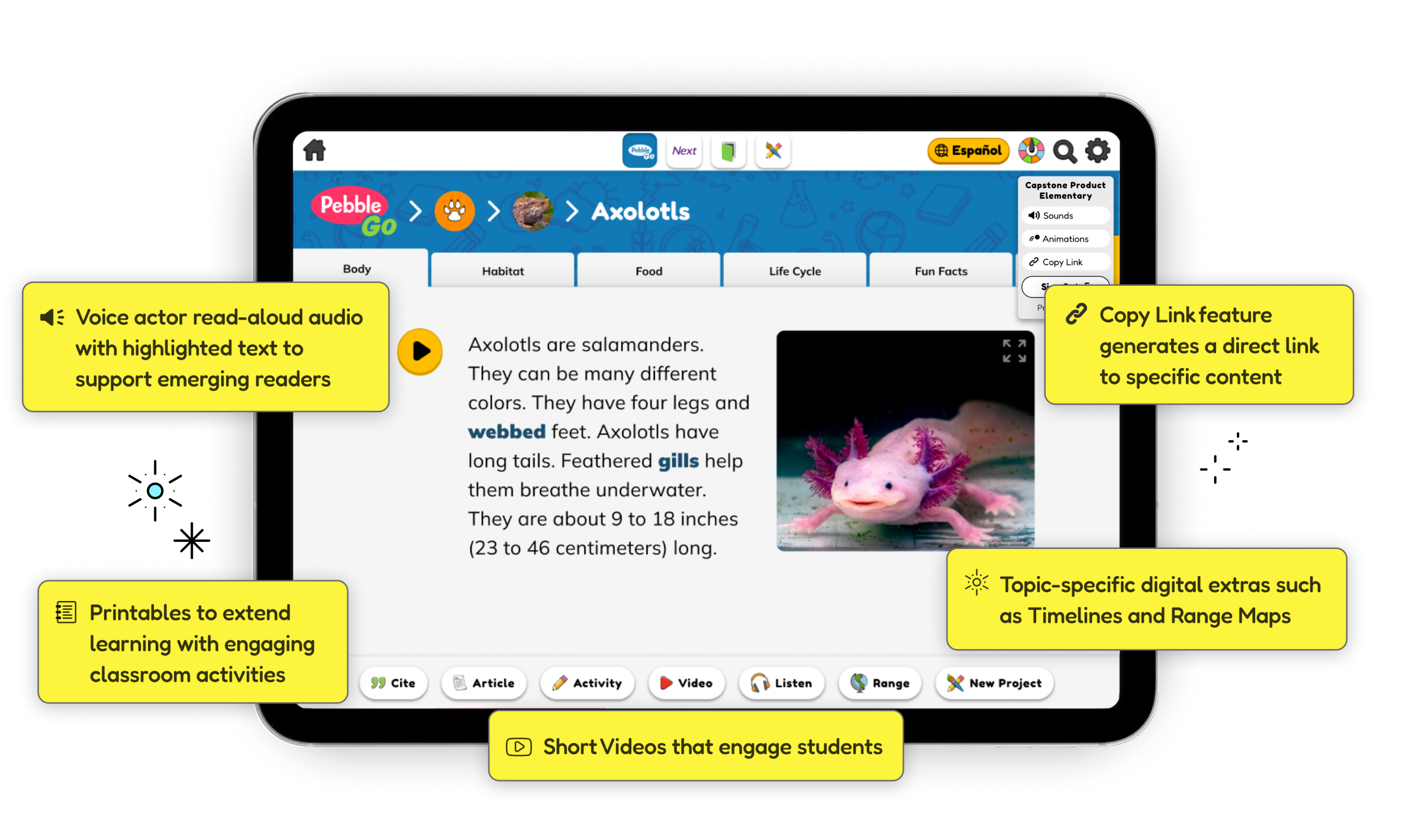
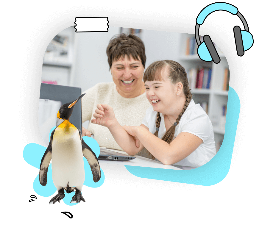
Your K-2 kids have questions about the world. Questions about their latest favorite animal, somehow even more obscure than the last (<a class="c-link c-body-link" href=https://pgoplayer.pebblego.com/articles/11999?sqs=SQSWDi89qAQdpUkMpC528POow== target=blank>what do axolotls eat for breakfast?</a>), and important-but-trickier questions like <a class="c-link c-body-link" href=https://pgoplayer.pebblego.com/articles/10437?sqs=SQSWDi89qAQdpUkMpC528POow== target=blank>‘How do I stand up for a friend?’</a> PebbleGo is the place where kids go to confidently discover the world, and where educators start the valuable work of helping them make sense of it.


K-2 kids are curious about the world, where can they go to explore it?


For Kids
PebbleGo provides a whole world of information specifically designed to be relevant and engaging for kids, making it the perfect place for independent exploration.

For Educators
PebbleGo is a crucial starting point for student inquiry and discovery, a place where teachers can confidently introduce a new topic, trusting that all the information has been designed to be understood by K-2 kids.
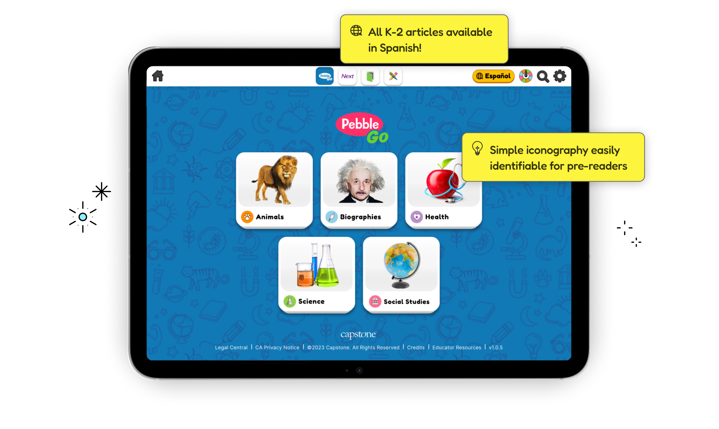
@h6 Available in Spanish! [url=/spanish]PebbleGo Spanish[/url] empowers Spanish-speaking learners to confidently explore topics they love with the same engaging content and kid-friendly design. Perfect for dual-language immersion programs, it provides high-quality curriculum support for research projects, building background knowledge, and scaffolding grade-level reading with read-along audio and highlighted text.